
Any views or opinions presented in this article are solely those of the author and do not necessarily represent those of the company. AHP accepts no liability for the content of this article, or for the consequences of any actions taken on the basis of the information provided unless that information is subsequently confirmed in writing.
Although there are many variables influencing healthcare costs, the most important are unit cost and utilization. Unit cost is subject to many constraints in relation to both healthcare and the broader economy. Much has already been written about the general inflation and its impending effects on healthcare costs[1]. Utilization is perhaps more malleable than unit cost and can provide an effective countermeasure to increasing unit costs. Insurers, health systems, and providers that manage utilization and contract accordingly will be the most successful during these fiscally challenging times. Utilization profiling offers an effective starting point to identify the greatest opportunities to improve profitability.
Data
This study utilized AHP’s Medicare Limited Data Set (LDS) which consists of a 5% representative sample of Medicare FFS claims across the United States. At the time of writing, 2021 data was unavailable and 2020 data likely contains some irregularities due to the pandemic. All members with Part A & B were included and those with an HMO plan were excluded. Utilization was summarized and compared at the county level, excluding counties with less than 20,000 member months in any given year. This yielded more than 200 counties each year from 2016-2020. Not only did this ensure credible results, but it also facilitated appropriate comparisons by excluding many rural areas which manifest unique healthcare characteristics. Risk scores for county-level populations were not available, which is an important consideration when comparisons are made between counties. Lastly, pharmacy data is not included in the LDS. Unless otherwise noted, utilization refers to the metrics listed in Exhibit 1.
Exhibit 1: Utilization Metrics
Utilization Whac-A-Mole
Effective care management should meaningfully impact the utilization characteristics of a population. In theory, a managed population will have higher utilization in lower-cost settings (PCP, specialist office visits) and lower utilization in higher-cost settings (emergency room, hospital inpatient). Conversely, a poorly managed population will have the opposite characteristics. At the county level, correlations between these service categories provide support for this theory.
Exhibit 2: Service Category Correlation
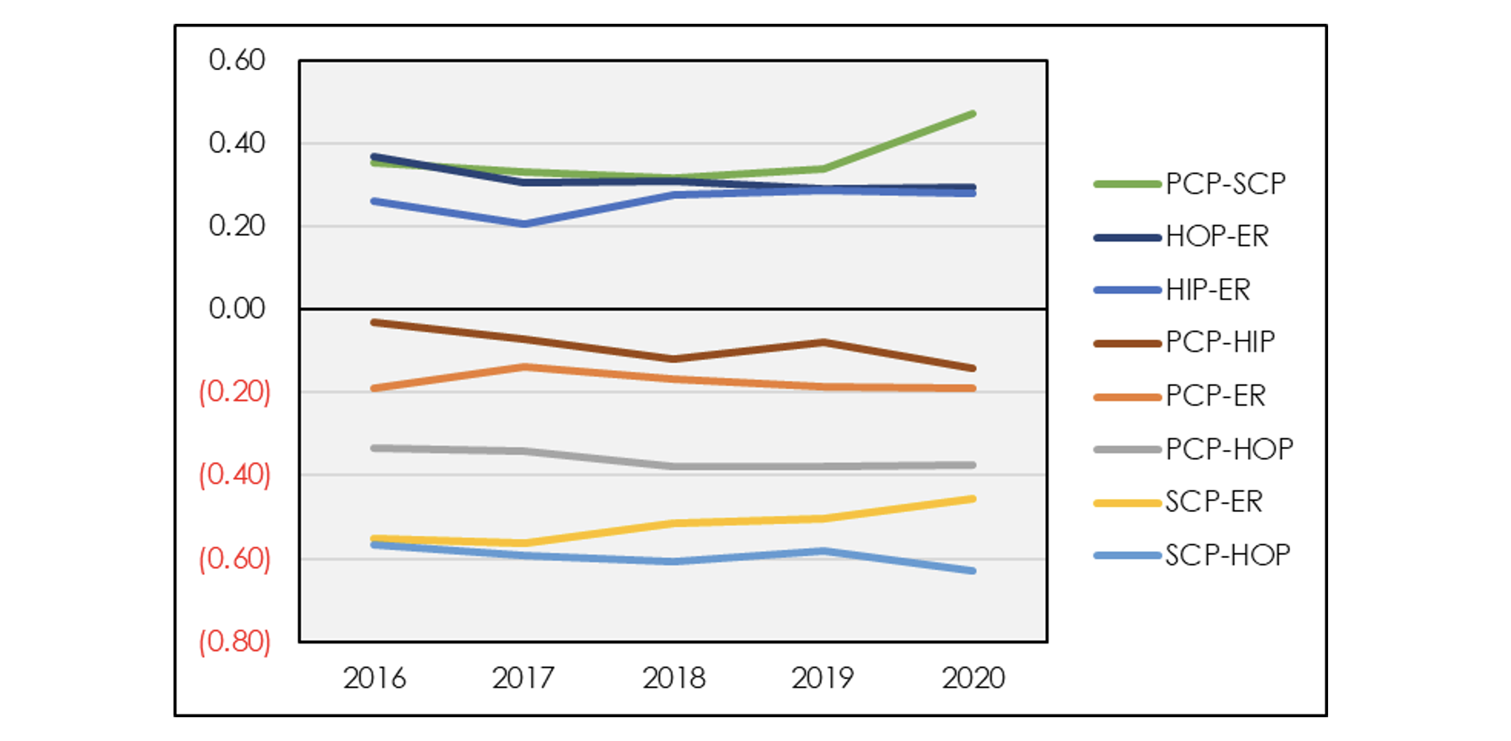
Exhibit 2 shows that correlations between types of service are relatively constant over time. There are several noticeable groupings. Among the service categories with positive correlation, emergency room is positively correlated with both hospital inpatient and outpatient services. Meanwhile, primary care and specialist office visits exhibit a similarly high positive correlation. On the negative side, primary care and specialist office visits are negatively correlated with emergency room visits, hospital inpatient and hospital outpatient. This provides support for the dichotomy between a well-managed versus poorly managed population. Although pharmacy data is not included in the LDS, pharmacy claims tend to correlate positively with primary and specialty care and negatively with hospital visits.
These correlations imply that utilization is highly unlikely to be decreased across the board. Instead, utilization management is akin to a game of whac-a-mole where decreasing utilization in one area will almost necessarily increase it elsewhere. Unlike whac-a-mole, where winning entails suppressing moles in every hole, the best strategy to lower overall costs is to intentionally increase utilization in cheaper settings while closely monitoring ER and HIP to prevent or manage any arising cases. As patients are directed more towards preventive care and office settings, fewer services will be required in more expensive settings. On the other hand, neglecting to proactively care for patients in cheaper settings allows for conditions to worsen until care requires a more expensive venue. The interwoven nature of these services shows how making targeted improvements in one area can impact the entire system.
Constructing Utilization Profiles
Utilization profiling incorporates a graphical depiction of utilization across all service categories to facilitate easy, informative comparisons.
Any evaluation needs to be holistic since utilization among various service categories is so closely interconnected and attempting to decrease utilization across all categories is likely futile. A very useful technique is to construct a “utilization profile.” Utilization profiling incorporates a graphical depiction of utilization across all service categories to facilitate easy, informative comparisons. The percentile ranking method converts nominal utilization metrics into percentiles relative to the entire population, such as the list of counties from LDS data. As an example, the chart below illustrates extreme examples of disparate utilization profiles: Lee County, FL exemplifies a system with effective care management in contrast to Jackson County, MO.
Exhibit 3: Example Utilization Profile Using Percentile Ranking
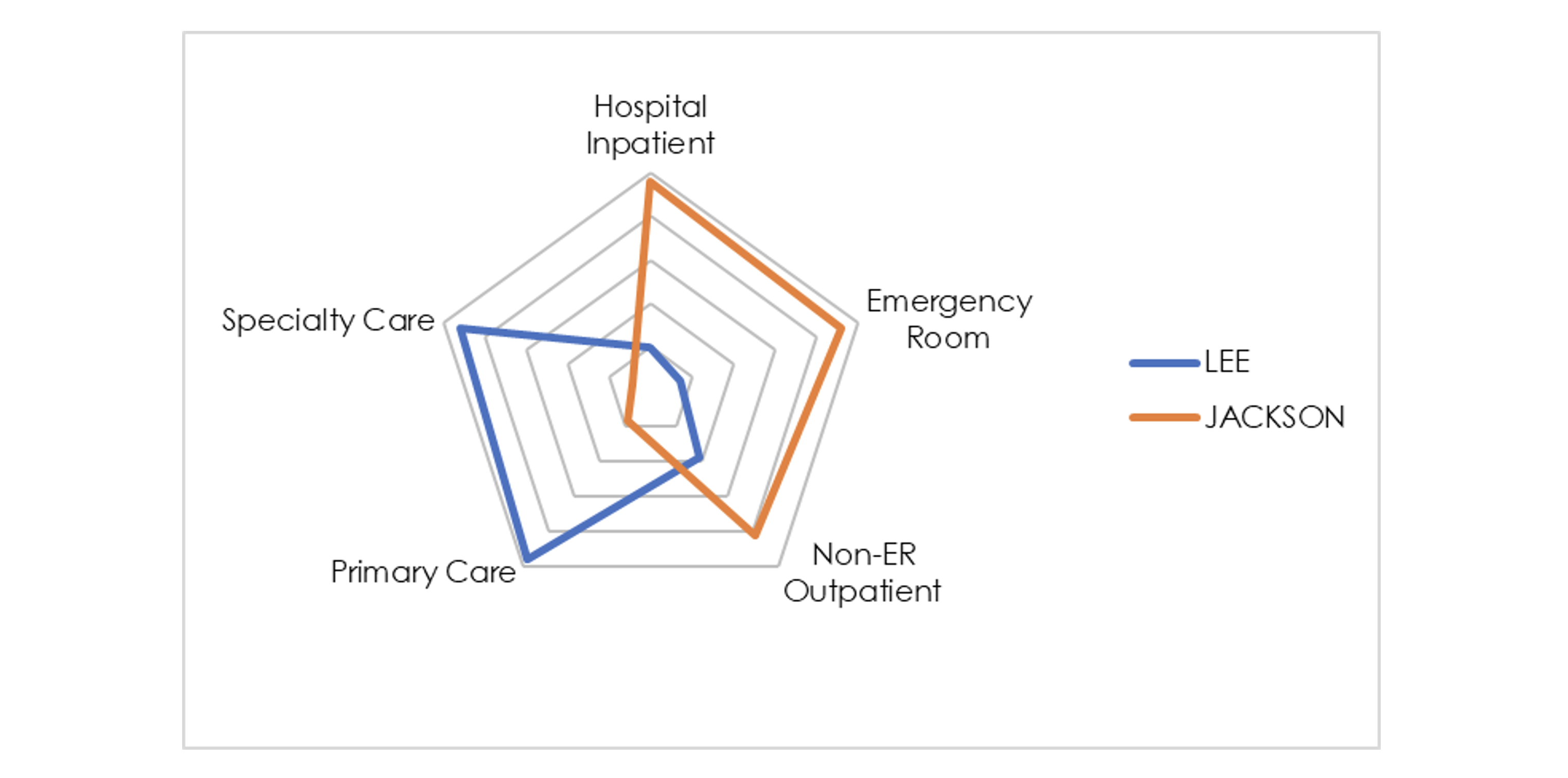
The radar graph provides an excellent depiction of utilization profiles. Utilization for each service category is converted into a percentile relative to the other ~200 counties with more than 20,000 member months in 2020. Higher utilization (relative to other counties) is shown by the line approaching closer to the outer edge. This chart demonstrates that Lee County has HIP and ER utilization in the 20th percentile while PCP and SCP utilization is above the 90thpercentile. Meanwhile, Jackson County is nearly the exact inverse. Due to the utilization “whac-a-mole” effect, it is unlikely that a utilization profile will ever be too close to the center in all service categories with this profiling methodology. Ideally, this type of analysis would also incorporate risk adjustment. Nevertheless, the contrast in care management is stark.
Percentile ranking can be useful for comparing against a region or industry as a whole; a downside is that it requires a large database such as the LDS.
Utilization profiles can be constructed in myriad ways. Percentile ranking can be useful for comparing against a region or industry as a whole; a downside is that it requires a large database such as the LDS. In the absence of industry data, profiling can be completed in relation to ideal benchmarks. These may be derived from financial/strategic objectives, contracts between payers and health systems, or robust statistical analysis. This practice is particularly important under any shared risk or value-based care arrangement. Exhibit 4 shows an example of a utilization profile using ideal benchmarks.
Exhibit 4: Example Utilization Profile Using Ideal Benchmarks
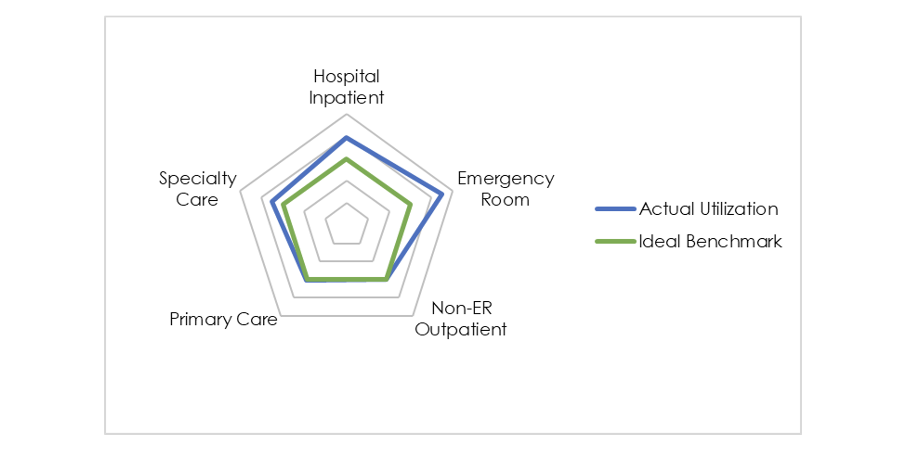
With this methodology, each utilization metric is converted into a percentage of the ideal and graphed accordingly. Exhibit 4 provides an example of a population with utilization metrics far higher than the ideal for emergency room and hospital inpatient. Interpreting this chart is more nuanced since the relationship to the ideal depends on whether the goal is to increase or decrease utilization. In this example, specialty care is under-utilized relative to the benchmark and therefore graphed outside of the ideal region. Unlike the percentile rank method, a population’s utilization profile might be tightly wrapped around the center of the radar graph if it is achieving ideal utilization (whether high or low) in every category. These are just two examples of how utilization profiling can be achieved.
Case Study: Utilization Profile Change Over Time
Utilization profiles can also be used to analyze changes over time. Care management initiatives are extremely common, but the most successful ones should have a noticeable impact on the utilization profile. The chart below shows the utilization profile for Jefferson County, AL over the last three years using the percentile ranking methodology relative to all other counties.
Exhibit 5: Jefferson County Utilization Profile Change Over Time
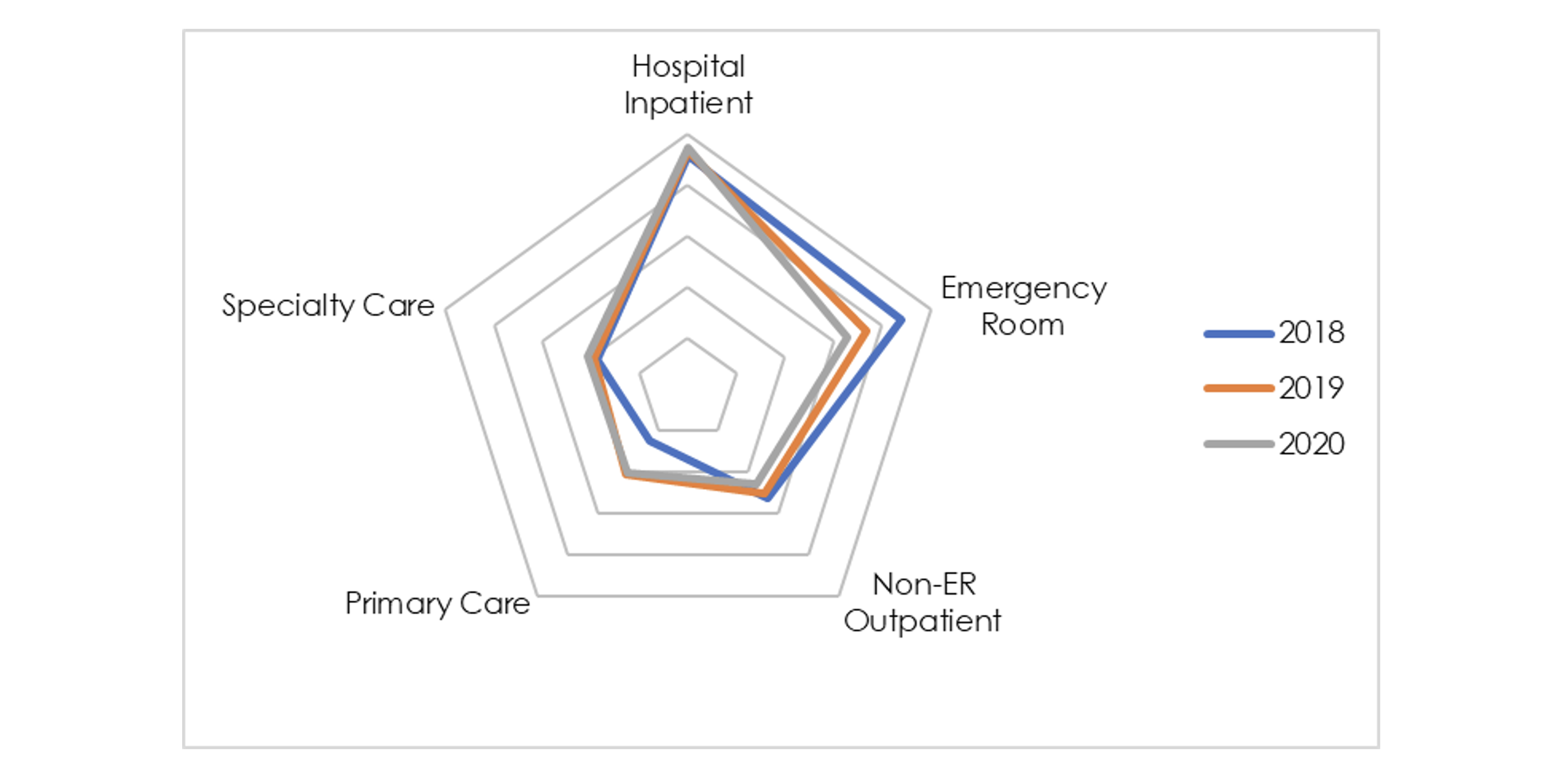
This case study illustrates how seemingly minor changes in utilization profiles can have a significant financial impact.
Observed changes are more subtle than in Exhibit 3, but there is a noticeable decrease in emergency room utilization in conjunction with an increase in primary care utilization. Since the radar graph is based on percentile relative to other counties in this example, it’s important to consider how changes in other counties might drive changes in Jefferson’s radar graph. With some basic math, it is easy to quantify the financial impact of this utilization shift. Overlaying 2018’s utilization from each category with 2020’s respective unit costs yields healthcare costs more than $100 PMPM higher than with the improved 2020 utilization. This case study illustrates how seemingly minor changes in utilization profiles can have a significant financial impact.
Conclusion
The ultimate goal of utilization profiling is to identify areas of opportunity to deliver quality care in lower-cost settings and subsequently lower healthcare costs. The benefit for insurers is clear – the case study demonstrated that even minor shifts in utilization profiles can significantly improve profits, which might in turn lead to lower premiums. Health systems and ACOs are often operating under shared risk/savings contracts and can equally benefit from improved utilization profiles. Medical groups may only represent one or two service categories, but it is important to understand their role in the larger health system and how they can provide value to their counterparties and gain more favorable contract terms. As healthcare stakeholders feel inflation-related pressure on their bottom line, understanding utilization profiles and potential improvements will become increasingly important.
Endnotes
[1] https://axenehp.com/are-we-in-for-some-significant-health-cost-increases/
About the Author
