
The mortality rate is 1%. The doubling time is 15 days. Today’s number of new cases is 7% lower than yesterday’s.
When a statistic is cited, it’s often a conversation-ender. Statistics are facts, aren’t they? And who’s going to question a fact?
In The Rime of the Ancient Mariner, Coleridge’s titular Mariner recalls the frustration of his thirsty crew while lost at sea:
Day after day, day after day,
We stuck, nor breath nor motion;
As idle as a painted ship
Upon a painted ocean.
Water, water, every where,
And all the boards did shrink;
Water, water, every where,
Nor any drop to drink.
Especially now that some of the regions hardest-hit by the pandemic are reporting decreasing or plateauing COVID-19 caseloads, an eager public is hopefully refreshing the webpage of their favorite Coronavirus tracker or local public health department, looking for signs the pandemic is ending.
Unfortunately: we are now the Mariner’s crew. We are surrounded—drowning—in statistics. And the value these statistics provide is getting better every day. But we should not accept reported numbers without some critical thought. We must be cognizant of the context, limitations, and definition of the statistics we follow. This prescription is valid for any statistic, and we actuaries pride ourselves on our ability to abide by those rules when using any data[1]. But given our collective insatiable appetite for data on the pandemic, we will today turn our critical actuarial eyes toward some of the most-cited COVID-19 statistics.
Case Counts are Wrong
One of the most breathlessly tracked statistics is the number of reported cases. Johns Hopkins has a widely cited tracker[2] with the current case count in bold red type at the top of the page. The team maintaining the tracker are transparent about their sources[3]: an online platform run by the Chinese medical community called DXY, the European CDC, the US CDC, the WHO, and many, many more. The team notes that manual updates are made but these are all confirmed with local public health departments before inclusion in the tracker. They also note that confirmed cases include presumptive cases. So, what’s the problem? The data collection process seems thorough and consistent.
But we may have an underlying data definition problem. What is the definition of a COVID-19 case? When the Hopkins team calls up all of the public health departments around the globe—are they all using the same definition for COVID-positive patients? Has each public health department even maintained a consistent COVID-positive definition internally?
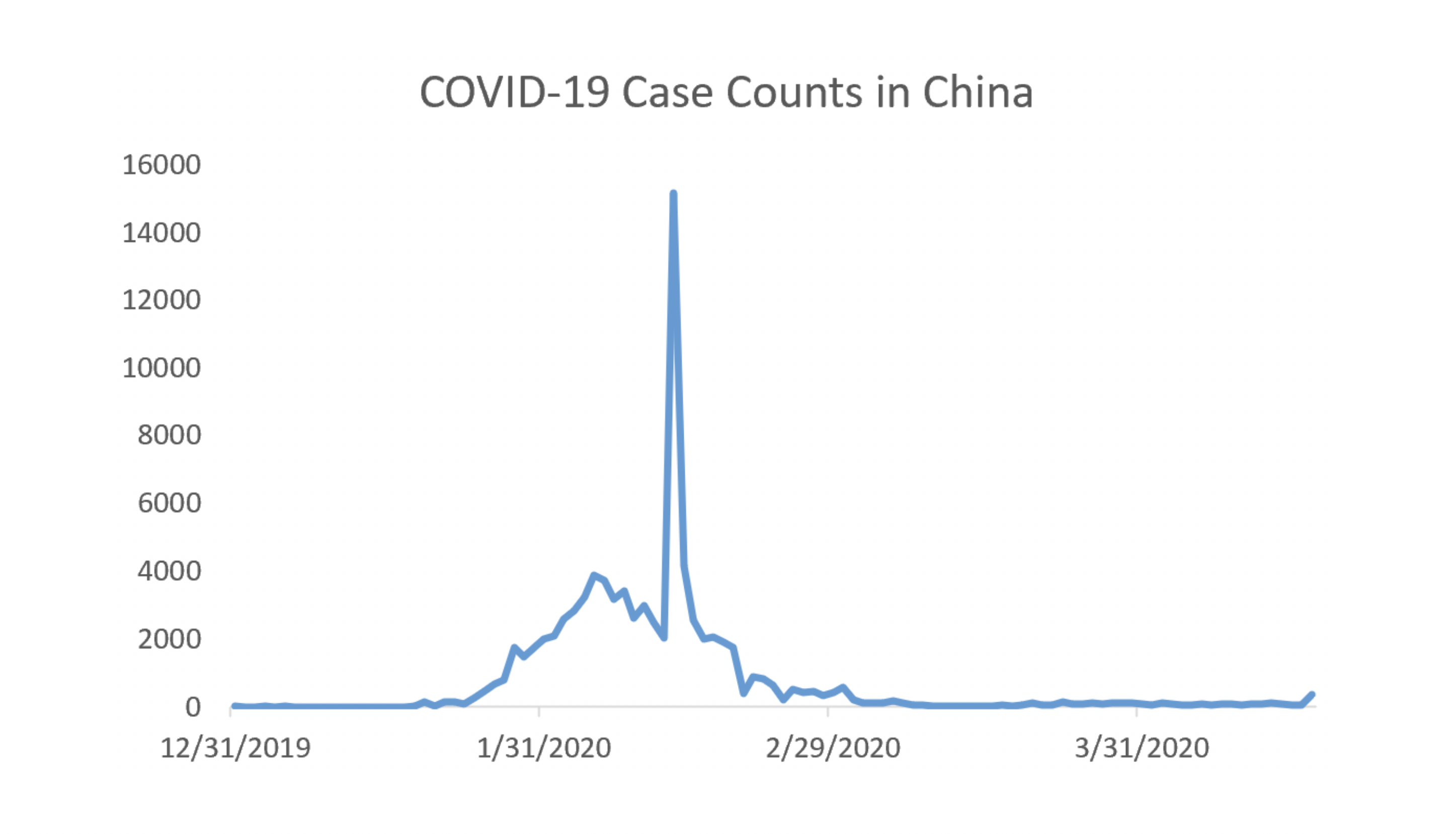
The short answer: Not necessarily. Below, we’ve plotted the reported case counts from China over the past three and a half months[4]. There is an obvious spike around mid-February. The spike is due to a change in the definition of positive COVID-19 cases[5]. Around February 12, Hubei province officials began using a clinical diagnosis to classify COVID-19 cases rather than test results. About a week later, they changed the definition again to classify COVID-19 cases using diagnostic tests rather than clinical diagnosis. So, whenever anyone is looking at the China data, they will need an asterisk around the February 12-20 data.
For the sake of argument, let’s say the Hubei province data issue from February is an anomaly. Say all other public health departments across the world have been using diagnostic tests to confirm cases. Then we could have some confidence in the reported case count, right? Well, not really. There are multiple diagnostic tests available. And the false negative rate for at least some of these is estimated to be staggeringly high, perhaps 30%[6]. This could be interpreted to mean that almost a third of the tests with a negative result are wrong. Affected patients would be told they don’t have COVID-19 when, in fact, they do.
There is a further issue: who is getting tested? Here is the U.S, testing capacity is still short of the needed levels[7]. Imagine you have COVID-19. Your symptoms are mild. You have no complicating risk factors or comorbidities. You call your doctor and are told to stay home[8]. If you stay home, untested, you will not be included in the official totals.
Compounding this issue are asymptomatic carriers[9]. These individuals would never think to request a test because (by definition) they aren’t aware they are sick. These issues lead to potentially dramatic underreporting of cases[10].
Death Counts are Wrong
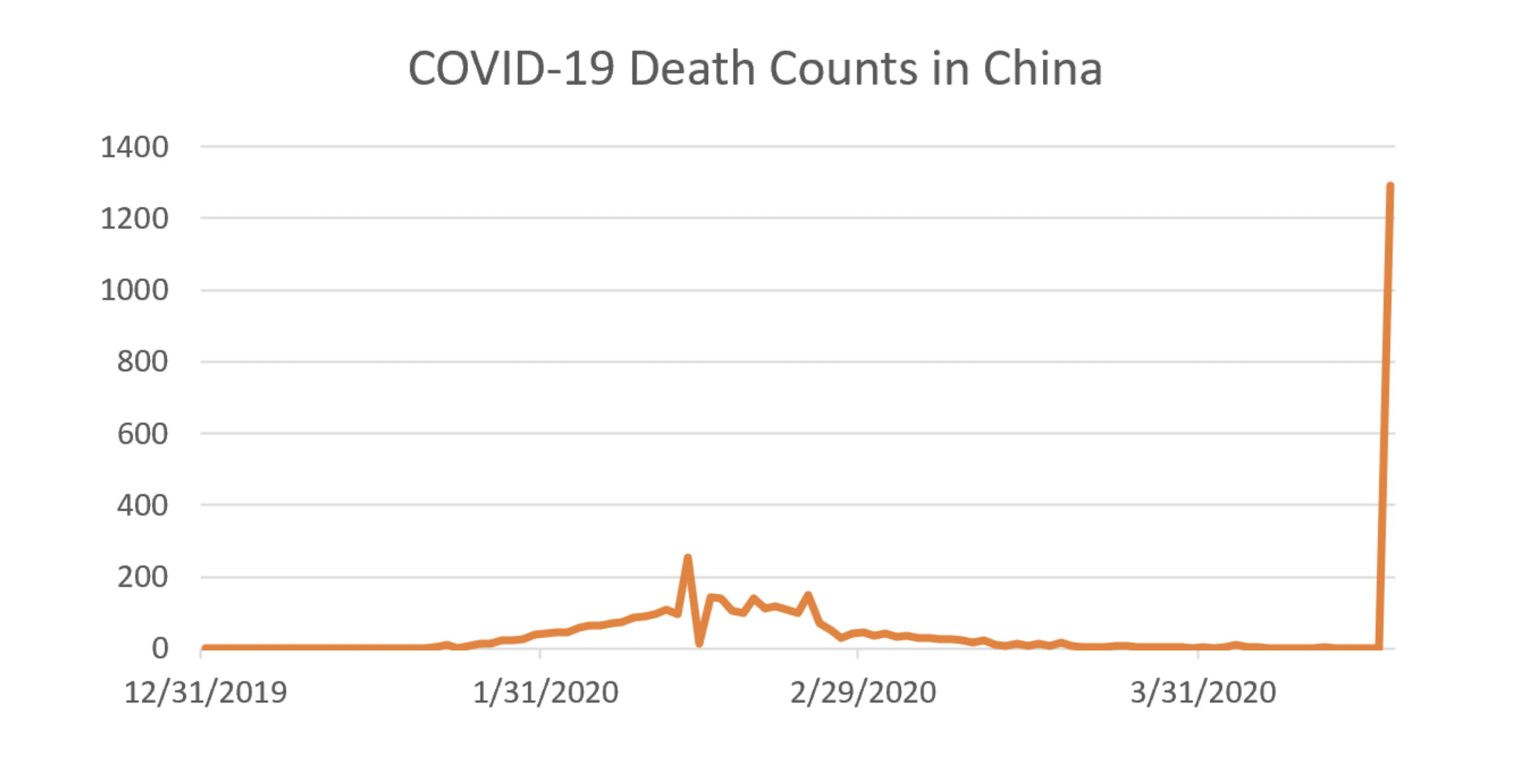
Death counts are problematic as well. There are issues counting deaths amongst the homeless; there are issues counting deaths amongst people who die at home[11]. There are issues counting deaths in facilities[12]. And just like we saw with case counts, definitions can change. New York recently recorded a large spike in deaths as they changed their death count to include people who were presumed to have COVID-19 but never tested positive for it[13]. China also recorded a spike in deaths in order to account for reporting delays they attribute to understaffing early in the epidemic[14]. The effect of adding the new counts dramatically affects the overall picture coming out of China, as shown in the graph below[15].
Reported mortality rates are even worse to rely on than the death counts. Mortality rates are calculated as a ratio of two numbers: the number of people who died from a disease, and the number of people who have a disease. Given that we don’t know either of those numbers, the ratio of the two is—at best—not particularly useful.
Trends Might be Useful
If cases are likely underreported, and deaths are likely underreported, on what can we rely? Is there a statistic we can look to as an indication of whether the pandemic is abating?
Yes—with a few caveats. Look to trends. If the rate of growth in death counts and case counts is slowing or even decreasing—that’s a good sign. The caveat is to be aware of the context. The number of positive cases slowing is good news only if testing capacity is increasing at the same time. Imagine a region where tests are suddenly unavailable. If positive cases are defined by diagnostic tests only, there will be no new cases reported in this region until tests become available again. In this scenario, the number of new cases reported (zero) has no bearing on the actual progression of the disease through the community.
The other caveat is to watch for changes in definitions in the data. For those following New York’s death counts but not carefully tracking the definition, it might have appeared there was a sudden shift in the trajectory of the disease. But we know better.
Eventually, once antibody testing is performed widely enough to achieve a statistically valid sample, we will have a better idea of how many infections and how many deaths were caused by this pandemic. In the meantime, for us thirsty sailors trapped in the sea of data—look to trends rather than individual counts and stay vigilant about context and definitions.
Endnotes
[1] http://www.actuarialstandardsboard.org/asops/data-quality/
[2] https://www.arcgis.com/apps/opsdashboard/index.html#/bda7594740fd40299423467b48e9ecf6
[3] https://systems.jhu.edu/research/public-health/ncov/
[4] Data pulled from the European CDC at: https://www.ecdc.europa.eu/en/publications-data/download-todays-data-geographic-distribution-covid-19-cases-worldwide
[5] https://journosdiary.com/2020/02/20/covid-19-china-changes-case-definition-hubei/
[6] https://slate.com/technology/2020/04/coronavirus-testing-false-negatives.html
[8] https://www.cdc.gov/coronavirus/2019-nCoV/hcp/clinical-criteria.html
[9] https://www.cebm.net/covid-19/covid-19-what-proportion-are-asymptomatic/
[10] https://www.businessinsider.com/real-number-of-coronavirus-cases-underreported-us-china-italy-2020-4
[11] https://www.nytimes.com/2020/04/10/nyregion/new-york-coronavirus-death-count.html
[13] https://www.nytimes.com/2020/04/14/nyregion/new-york-coronavirus-deaths.html
[15] Data pulled from the European CDC at: https://www.ecdc.europa.eu/en/publications-data/download-todays-data-geographic-distribution-covid-19-cases-worldwide
About the Author

Any views or opinions presented in this article are solely those of the author and do not necessarily represent those of the company. AHP accepts no liability for the content of this article, or for the consequences of any actions taken on the basis of the information provided unless that information is subsequently confirmed in writing.