
It seems natural to assume that the scientific underpinning of medicine implies a formulaic treatment for any given combination of presenting symptoms. However, this assertion ignores the artistic nature of care management. Many would be surprised to discover the high degree of variation in care management techniques that occur even within the United States, locale of the avant-garde of medicine. This study demonstrates how utilization metrics for a Medicare population can present high variation across geographic regions, as well as the significant savings resulting from a utilization profile oriented towards managed care.
Data
This geographic study utilized AHP’s Medicare Limited Data Set (LDS) which consists of a 5% representative sample of Medicare FFS claims across the United States. At the time of writing, 2020 data was unavailable and would likely demonstrate irregularities due to the COVID-19 pandemic. Utilization was compared across counties with greater than 20,000 member months in the LDS, which yielded 196 counties. Not only did this ensure credible results, but it also facilitated appropriate comparisons by excluding many rural areas which manifest unique healthcare characteristics. Risk scores for county-level populations were not available, which is an important consideration when comparisons are made between counties. Furthermore, pharmacy data is not included in the LDS.
Results
Table 1 provides a summary of utilization metrics across major Part A & Part B categories of service. The minimum and maximum values show the wide utilization disparity that can occur between regions. Comparing the median and average utilization shows that several categories are skewed by outlier counties with extraordinarily high utilization, which is most prominently displayed in non-ER outpatient and post-acute care.
Table 1: Utilization Summary Statistics
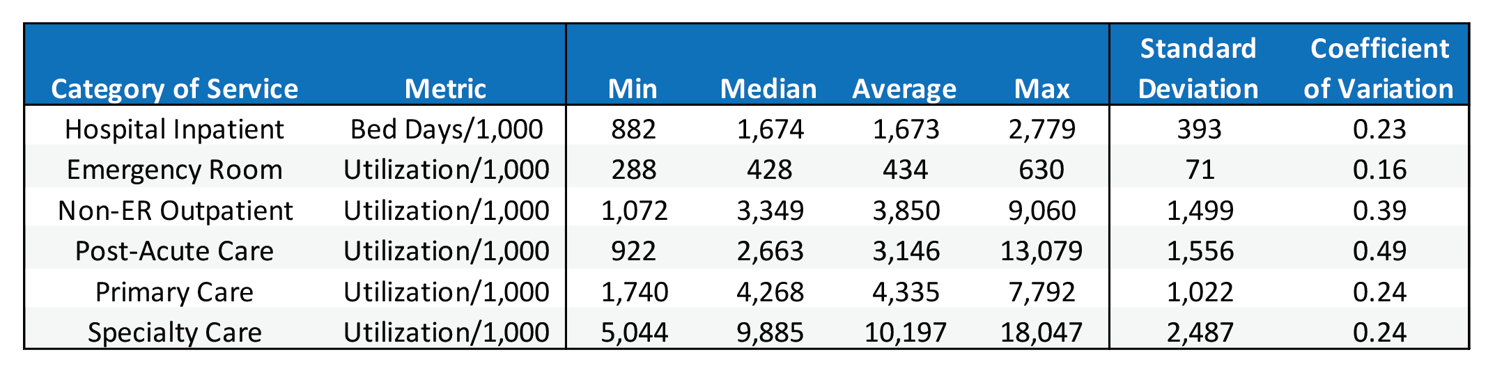
The coefficient of variation measures the dispersion of data points around the mean and can be used to compare the degree of variation among the categories of service. Unsurprisingly, the categories with the most skewed distributions also have the highest coefficient of variation. Emergency room care has the lowest coefficient of variation, indicating that ER utilization is relatively similar across geographies and care management techniques. Furthermore, primary care, specialty care, and hospital inpatient all have very similar coefficients of variation.
What factors influence the utilization variance demonstrated in Table 1? Certainly, there are differences in health status and patient needs among different geographies. If county-level risk factors were available, it would be possible to ascertain how much variance is explained by health status. However, a larger portion of the variance is likely attributable to differences in provider practice, which can usually be tied directly to training in residency.
Table 2: Service Category Correlation Matrix
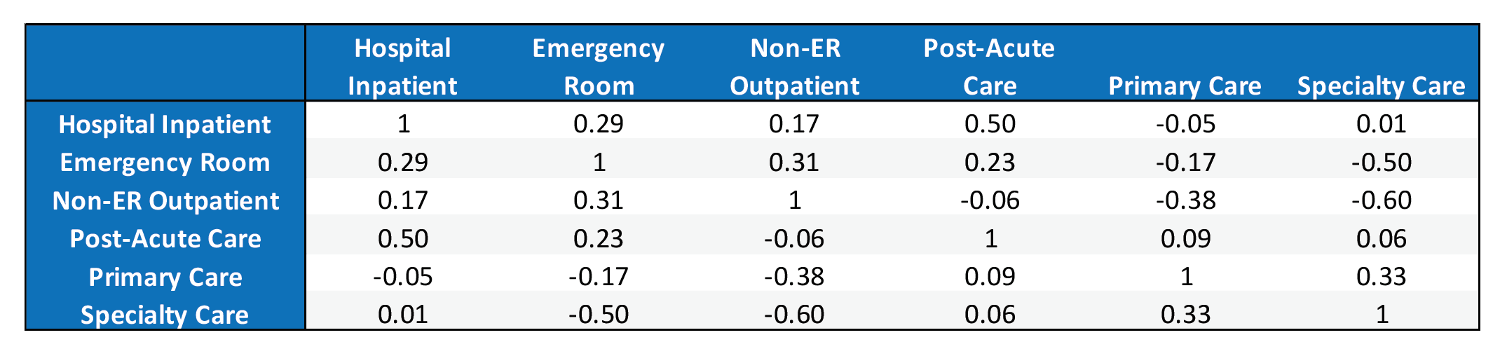
A correlation matrix for utilization is shown in Table 2. A much deeper analysis of the relationship between categories of service is beyond the scope of this article, but a few observations are worth noting. First, primary care has a negative correlation with hospital inpatient, emergency room, and non-ER outpatient care. This corroborates the benefits of primary care pertaining to care efficiency and minimizing utilization where unit costs are high. In addition, specialty care has a strong negative correlation with emergency room and non-ER outpatient care. In total, this implies that utilization cannot simply be decreased across the board. Rather, counties with efficient care direct patients towards primary and specialty care rather than facilities. Although pharmacy data is not included in the LDS, pharmacy claims tend to correlate positively with primary and specialty care and negatively with hospital visits.
In total, this implies that utilization cannot simply be decreased across the board. Rather, counties with efficient care direct patients towards primary and specialty care rather than facilities.
These correlations align with a general understanding of the health care system. Scheduling regular PCP visits often lead to specialist referrals, explaining the 0.33 correlation. These also tend to drive higher prescription drug claims and help prevent the patient from going to the hospital and ER.
A Simplified Ranking Methodology
Based on these findings, a simplified scoring system could be used to rank counties by their care management based on utilization. A score of 1 to 5 was assigned to each category based on the percentile of each county relative to the other 195 in the sample. The correlation analysis showed that higher care management and PCP utilization will correspond with higher specialty care and post-acute care. So, the highest quintile of utilization for these categories received a score of 5, with each subsequently lower quintile receiving one less point. On the contrary, inpatient days, emergency room, and non-ER outpatient care received a score of 5 for having the lowest quintile of utilization. Ultimately, the higher average score corresponds to utilization that reflects greater emphasis on care management. The scores for each category were weighted according to Table 3.
Table 3: Service Category Weights

Table 4 shows the average score for the top 10 and bottom 10 counties based on the aforementioned methodology. Florida counties scored very high relative to other states, while the lower counties represented a mix of states.
Table 4: Top & Bottom 10 Counties
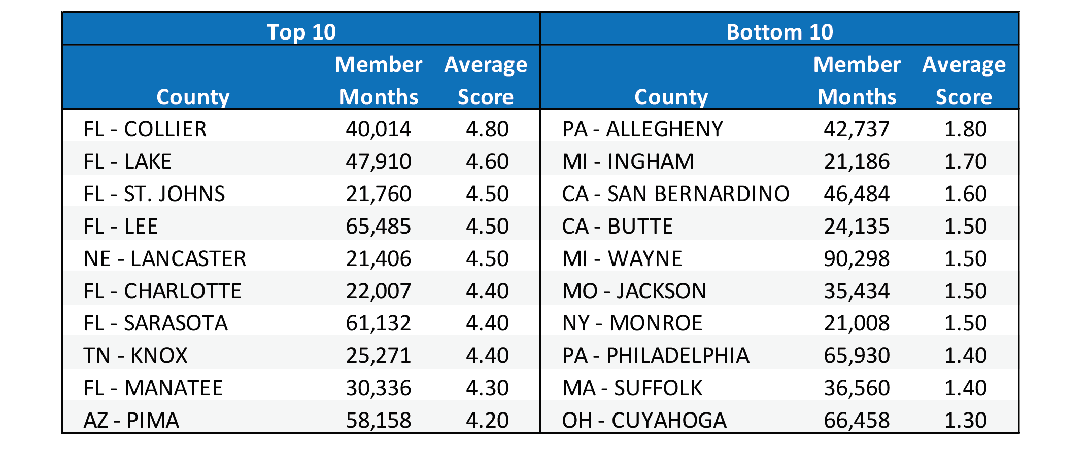
This scoring merely provides an example of how to compare utilization profiles and category weights could be adjusted to emphasize certain desirable forms of care. The rankings shown in Table 4 are not risk adjusted nor do they account for quality metrics so they should not be used to infer the quality of care management. Accounting for those other variables is beyond the scope of this article.
Case Study: Dallas-Ft. Worth
Unfortunately, the absence of county health risk scores means that any comparison between counties will have shortcomings. However, in the absence of risk adjustment the Dallas-Ft. Worth metroplex offers an ideal case study. Dallas and Tarrant County likely represent two very similar populations by being in the same state and encompassing large urban areas situated adjacently.
Utilization profiles for each county can be visualized using a radar graph, as shown in Chart 1. Each band on the radar graph represents a quintile according to the scoring methodology discussed in the previous section. A profile positioned tighter around the center of the graph represents utilization oriented towards managed care. More specifically, this corresponds with high utilization of primary, specialty, and post-acute care accompanied by low utilization of hospital inpatient, ER, and non-ER outpatient. Therefore, a tight web does not imply low utilization across all dimensions; rather, it should be interpreted as a tight grasp on expensive utilization by means of increased managed care.
Chart 1: Utilization Profiles for Dallas & Tarrant County
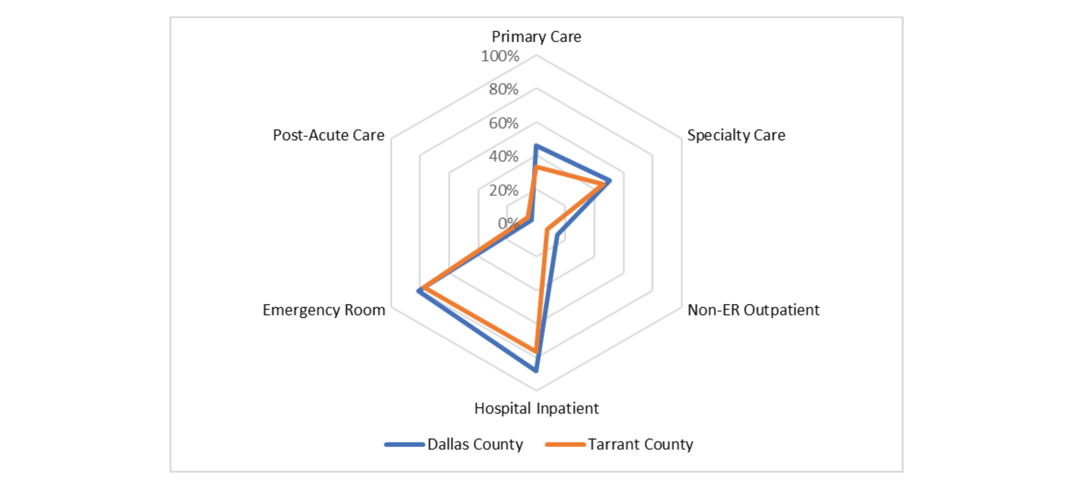
Although their utilizations are relatively similar, Tarrant County’s utilization is shifted slightly more towards care management with higher PCP & specialty care and lower inpatient and outpatient care. Table 5 shows the financial impact when Tarrant County’s utilization is merged with Dallas County’s unit costs. It is evident that even a small shift towards primary care yields meaningful PMPM savings.
It is evident that even a small shift towards primary care yields meaningful PMPM savings.
Table 5: Financial Impact of Utilization Variance
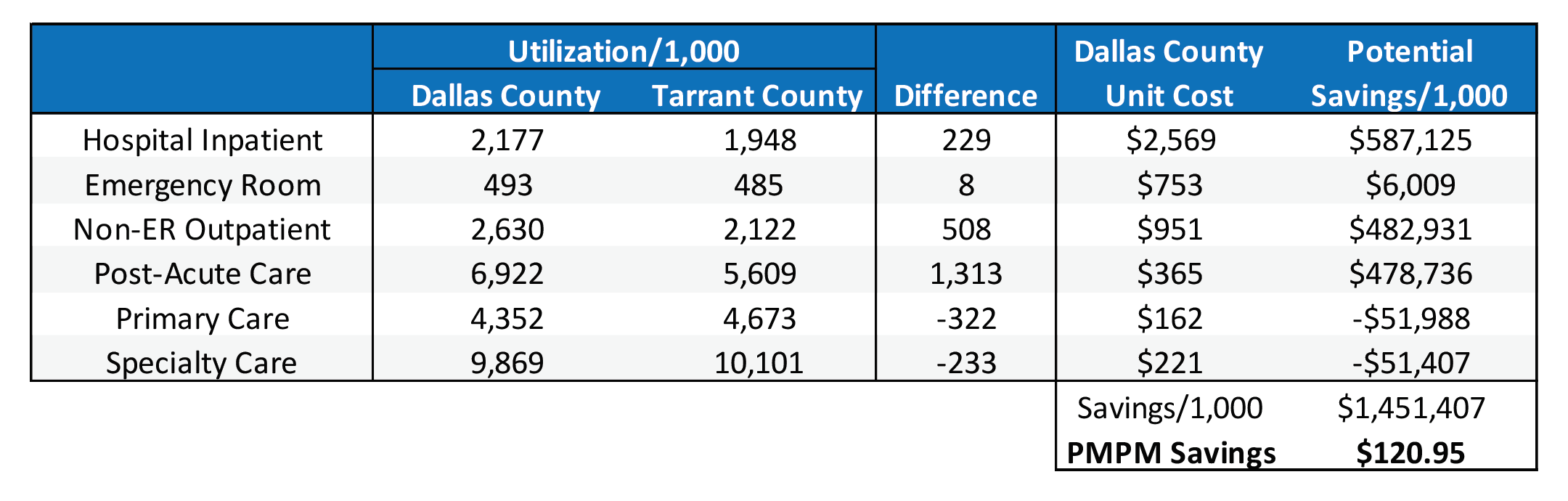
Given that Dallas County had approximately 1.9 million Medicare member months in 2019, the $120.95 PMPM savings equates to approximately $230 million that year. Limiting the categories to only hospital inpatient, emergency room, primary care, and specialty care still results in savings of $58.04 PMPM. Once again, these extraordinary savings is caveated by the absence of risk adjustment and pharmacy utilization. It is likely potential savings would be marginally reduced given pharmacy’s typical correlation with primary care, but it is safe to assume that meaningful savings would still be achieved.
Conclusion
In the manufacturing industry, the absence of variation is a key element of quality measurement. For example, car doors manufactured in different plants should install and function equally. Although it is not a perfect analogy, what level of confidence can be placed in the U.S. healthcare quality if counties exhibit such drastic utilization variance? Furthermore, the most effective and efficient manner to lower total health care costs is not accomplished by attempting to lower utilization across all categories.Significant savings can be achieved by targeting a utilization profile that emphasizes managed care and office visits over facility claims. The Dallas-Ft. Worth case study demonstrates that even with increased primary care, specialty care, and pharmacy costs, avoiding expensive hospital visits lowers total costs substantially. In addition, a patient enjoys a greater quality of life by avoiding the hospital, leaving more hospital resources available for the patients who truly need them. The COVID-19 pandemic has demonstrated the importance of efficient resource allocation, which can be supported by a proper utilization profile.
About the Author

Any views or opinions presented in this article are solely those of the author and do not necessarily represent those of the company. AHP accepts no liability for the content of this article, or for the consequences of any actions taken on the basis of the information provided unless that information is subsequently confirmed in writing.