
Overview
The American health care industry is a leviathan. Health care has swelled to dominate 18% of national GDP, and health care spending is expected to outpace overall economic growth[1]. The debate about this issue—the staggering amount of resources needed to maintain the current health care system—is contentious. However, though opinions differ regarding which solutions will most effectively address the rising cost of health care, there appears to be no debate that the price tag is an issue that must be addressed now.
Health care industry stakeholders are generally familiar with the Triple Aim of health care developed by the Institute for Healthcare Improvement. The Triple Aim (quality improvement, population health improvement, and cost reduction) can be used as a framework to develop and evaluate health care initiatives. Codified into this framework is the importance of cost; it is well-understood that cost-effectiveness must play a role in any viable solution (at least in the long-term).
But cost does not exist in a vacuum. Someone is paying the high cost of health care. Thus, it is not just the cost of care that matters, but rather, the affordability of that care: the cost of care in relation to available resources. Assessing affordability necessitates consideration of both cost and the ability to pay.
Though the term “affordability” has been a primary feature of the public discourse on the American health care system in recent years (particularly surrounding discussion of the Patient Protection and Affordable Care Act (PPACA) of 2010), the focus on cost has often overshadowed the conversation about ability to pay. The intent of this paper is to highlight both sides of affordability, to recognize the financial burden on the payer or purchaser of health care services.
In the discussion that follows, we assess affordability on a state-by-state basis by comparing health care costs with the purchaser’s annual income. This analysis is accomplished using the AHP Health Care Affordability IndexTM.
AHP Health Care Affordability Index
The AHP Health Care Affordability IndexTM(AHP HCAITM) was developed in order to measure and evaluate relative health care affordability for key stakeholders across various geographic regions. For each stakeholder within each region, we calculate the ratio of health costs to annual income. We then develop the AHP HCAI for each stakeholder by normalizing the result to a standard affordability level, so that we can compare the relative affordability of each region.
For purposes of this study, we have calculated the AHP HCAI for the three major purchasers of health care: employees, employers, and the government. We have additionally created a Private Payer AHP HCAI by combining the employer and employee perspectives, as well as a National AHP HCAI by combining all three perspectives. Our findings are demonstrated in the discussion below.
Given that the AHP HCAI is calculated as a ratio of costs to income, a jurisdiction with a lower AHP HCAI is interpreted to be more affordable than one a higher AHP HCAI. In other words, the lower the AHP HCAI, the more affordable the healthcare in the jurisdiction.
Employer HCAI
The Employer HCAI is intended to demonstrate relative health care affordability for employers by region or jurisdiction. The index is calculated as the ratio of employer paid health care costs to employer income, which is defined for purposes of this paper as state GDP. The methodology used to estimate employer health care costs and state GPD for input into the Employer HCAI formula is described in Appendix A.
The Employer HCAI for 2017[2] is shown in Table 1 below, organized from most affordable to least affordable:
Table 1: Summary of Employer HCAI by Jurisdiction for 2017
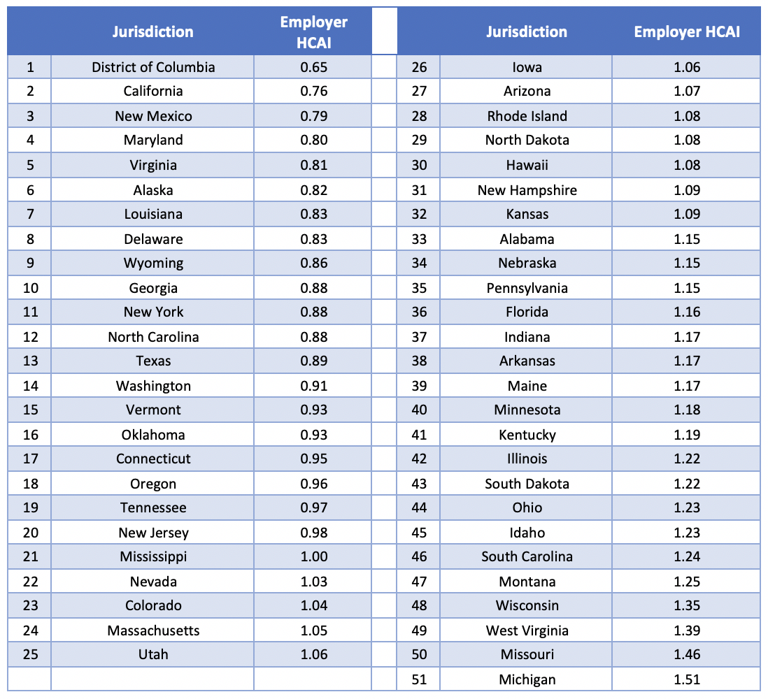
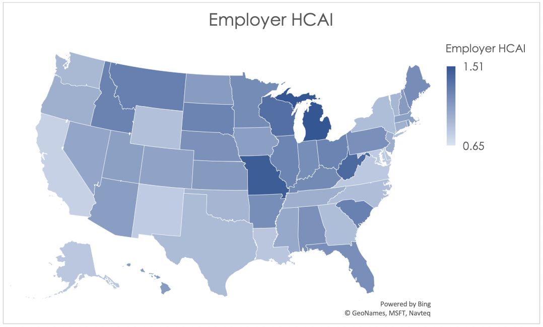
The graphical depiction of the Employer HCAI in Figure 1 below illustrates that the least affordable regions are concentrated primarily in the Midwest region of the United States, while the most affordable states are located on the west and east coasts.
The more affordable areas tend to have relatively high state GDP; enough so that the high health care costs in these states are offset. For example, New York in recent years was among the top five jurisdictions for highest average expenditures, but also was typically in the top five for highest average state GDP. For similar coastal states, health care appears to be more affordable despite the higher cost because more resources are available.
Figure 1: Employer HCAI by Jurisdiction for 2017
We have calculated the Employer HCAI from 2008 on, as demonstrated in Table 2 below.
Table 2: Employer HCAI Over Time
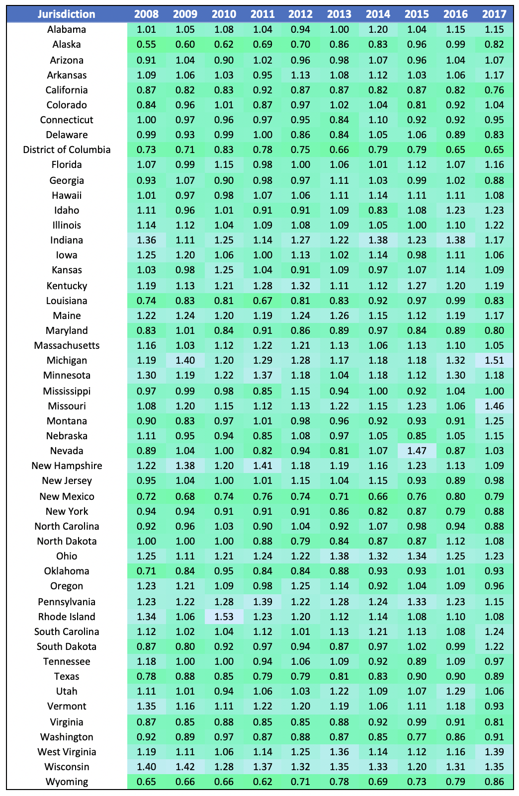
Using the data in Table 2, we find that the standard deviation of the Employer HCAI had been falling or holding steady since 2011 with a sudden sharp uptick in 2017. This could indicate the beginning of a trend in a wider disparity in affordability amongst jurisdictions. In fact, there is an increasing trend in the maximum Employer HCAI, while the minimum is relatively steady. This indicates that affordability in some states (like Michigan and West Virginia) is deteriorating faster than the average.
Employee HCAI
Though the individual market has grown substantially relative to pre-PPACA levels[3], it is still a much smaller market than the employer-sponsored group insurance market; about 50% of the U.S. population has health care insurance coverage through their employer, while less than 10% of the population is covered through the individual market[4]. Given this discrepancy, we will focus on affordability for those enrolled in employer-sponsored group coverage in this section, although the topic of affordability on the individual market is an interesting one and could be the subject of a follow-up report.
The Employee HCAI is calculated as employee health care costs divided by employee income. Employee health care costs include premium, deductibles, coinsurance, and copays, as well as out-of-pocket payments for items or services that are not covered by insurance. The methodology used to estimate each of these for input into the Employee HCAI formula is described below in Appendix A.
The Employee HCAI for 2016[5] is shown in Table 3 below, organized from most affordable jurisdiction to least affordable:
Table 3: Summary of Employee HCAI by Jurisdiction for 2016
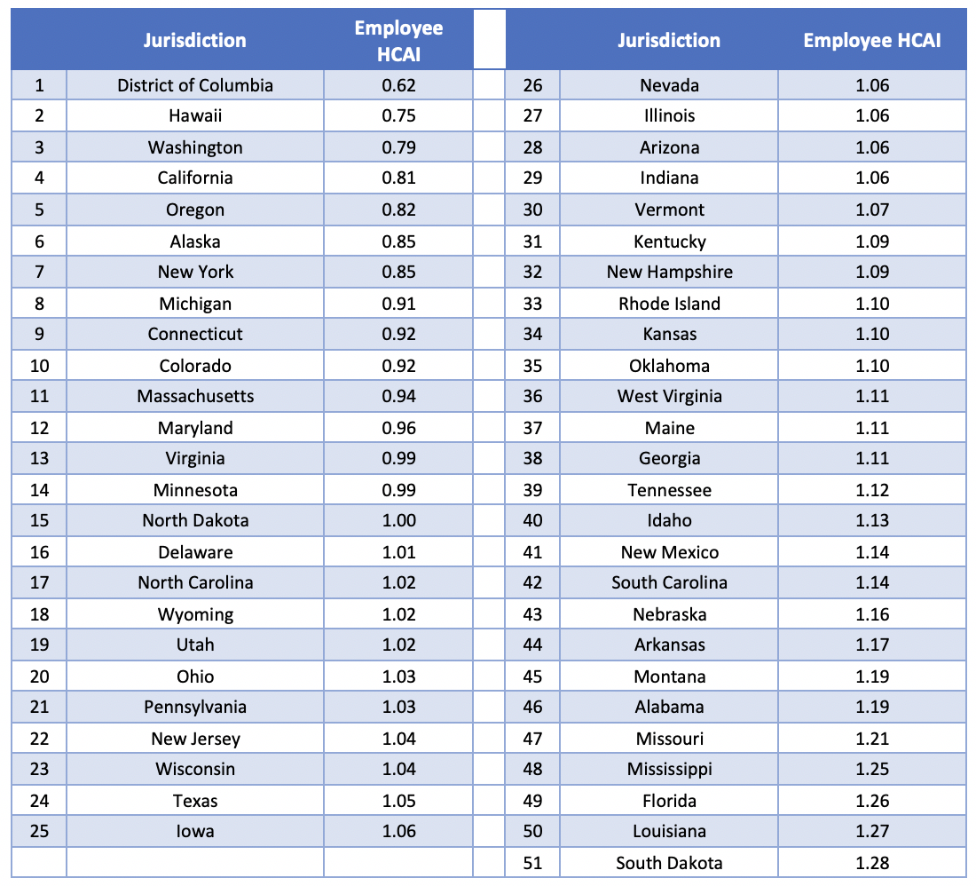
The graphical depiction of the Employee HCAI in Figure 2 below illustrates that the least affordable regions are concentrated in the southeast and Midwest regions of the United States, while the most affordable states are located in the west and northeast. Though it may seem counterintuitive that some of the most affordable states are also states with notoriously high cost of living (California, New York, and the D.C./Maryland region), these are also states with higher than average incomes. The high average incomes result in health care expenditures comprising a lower percentage of income, so that health care is relatively more affordable in these states. This finding come with an obvious caveat about income inequality, particularly for very populous and diverse states like California. A lower Employee HCAI in aggregate does not preclude the existence of pockets of very unaffordable regions on a more local level.
Figure 2: Employee HCAI by Jurisdiction for 2016

We have calculated the Employee HCAI from 2008 on, as demonstrated in Table 4 below.
Table 4: Employee HCAI Over Time

Table 4 demonstrates that there is not much movement in the order of most to least affordable jurisdictions. States that are among the least affordable (South Dakota, Louisiana, Mississippi, Florida) tend to stay among the least affordable, while the same is true for the high-affordability jurisdictions (D.C., Hawaii, Washington, California). This suggests that to the extent affordability has been improved over the past decade, states that were lagging behind others are still lagging behind.
Private Payer HCAI
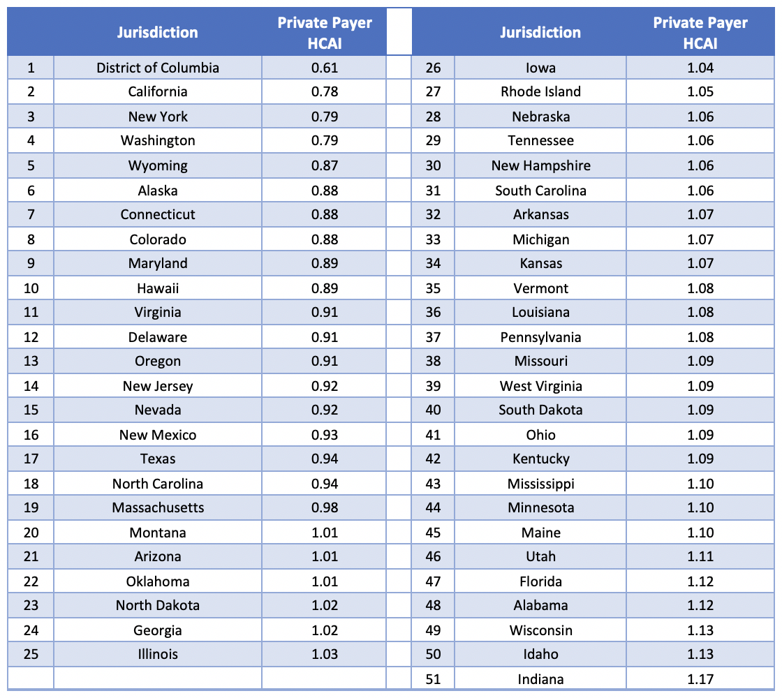
We have combined the Employee HCAI with the Employer HCAI to create the Private Payer HCAI. The results are summarized in Table 5 below:
Table 5: Summary of Private Payer HCAI by Jurisdiction for 2016

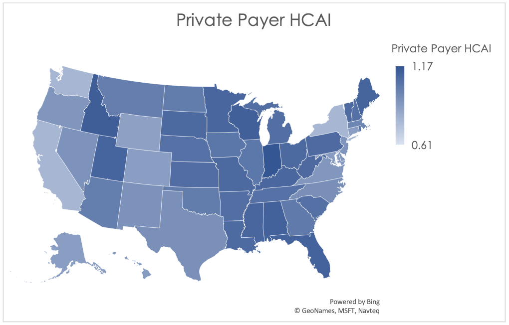
The graphical description of Private Payer HCAI shown below in Figure 3 demonstrates that, as expected, the Midwest and Southeast regions are the least affordable for employees and employers combined, while coastal regions have more favorable indices.
Figure 3: Private Payer HCAI by Jurisdiction for 2016
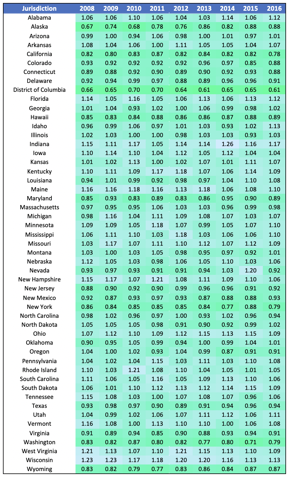
In Table 6 below, we have calculated the Private Payer HCAI from 2008 to 2016. Please note that, similar to the 2008-2016 HCAI demonstrations in Table 2 and Table 4, we find that very few states tend to experience dramatic change in their HCAI over time.
Table 6: Private Payer HCAI Over Time
Government HCAI
The final payer that we will consider is the government. Both the federal and state governments act as payers: Medicaid and CHIP have both federal and state funding sources, while Medicare is funded on a federal level. Federal and state governments also act as employers and so fund some of their employees’ share of health care premiums, in addition to funding other health care activities and programs such as subsidies on the PPACA exchanges and health care coverage for active-duty military, their families, and veterans. Since the non-employer, non-Medicare/Medicaid pieces comprise the minority of total government health care expenditures (less than a fifth[6]), we will focus on Medicaid, CHIP, and Medicare for purposes of this analysis.
The Government HCAI is calculated as state and federal health care costs divided by government income. Government income includes taxes as well as premiums paid for Medicare Part B and Part D. The methodology used to estimate both costs and income for purposes of computing the Government HCAI is described below in Appendix A.
The Government HCAI for 2016[7] is shown in Table 7 below, organized from most affordable to least affordable:
Table 7: Summary of Government HCAI by Jurisdiction for 2016
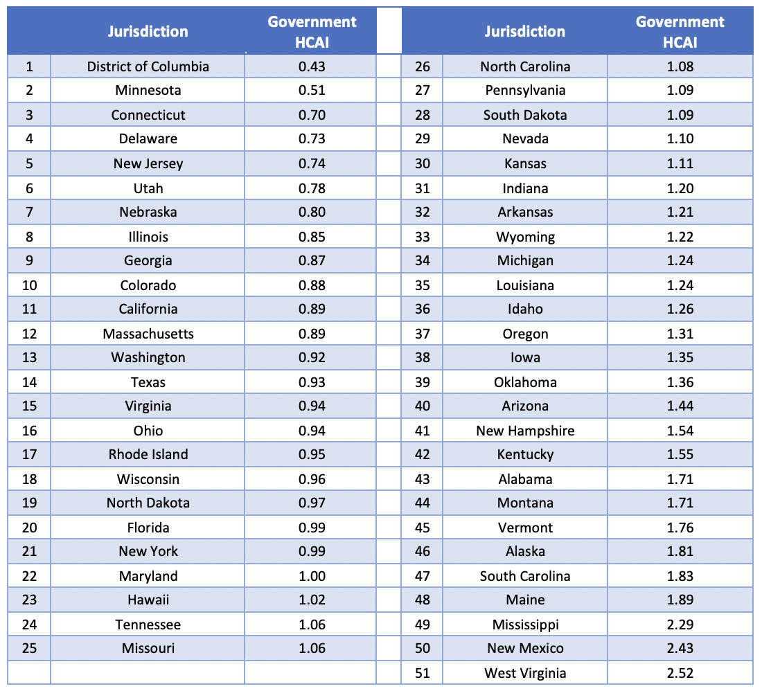
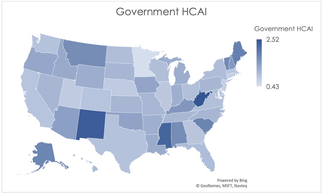
The graphical description in Figure 4 below clearly illustrates the wide range in Government HCAI even after normalizing the results. New Mexico, West Virginia, and Mississippi are the least affordable states from a government perspective for calendar year 2016, due to their values for both income and expenditures. These three states range from the 78thto the 88thpercentile for Medicaid and Medicare expenditures per capita, while federal and state tax income per capita is the lowest in these three states relative to all other states. On the other end of the index we find states with very high taxes per capita: Minnesota, Delaware, and the District of Columbia.
Figure 4: Government HCAI by Jurisdiction for 2016
We have calculated the Government HCAI from 2010 on, as demonstrated in Table 8 below.
Table 8: Government HCAI Over Time

Table 8 demonstrates that the range of indices has been growing over the past few years, implying the affordability differences between states are becoming more and more disparate.
National HCAI
Similar to the Private Payer HCAI, the National HCAI is derived from other indices. It is computed as the straight average of the Employee HCAI, Employer HCAI, and Government HCAI. Results are demonstrated in Table 9 below.
Table 9: Summary of National HCAI by Jurisdiction for 2016
The graphical description of National HCAI shown below in Figure 5 looks similar to the graphical depiction of the Government HCAI. This is because the wide range of values in the Government HCAI results in some states appearing to have a larger weight placed on the government results. This could be alleviated by using unequal weights in the average; for example, some stakeholders might believe the employee experience should have more clout than the employer or government shares, and so assign a weight of 50% to the employees alone when calculating the National HCAI. For purposes of our demonstration, though, we have assumed 1/3 weights in the average for each of the 3 constituencies included in our analysis.
Figure 5: National HCAI by Jurisdiction for 2016

Table 10 below demonstrates the historical values for the National HCAI for 2010 to 2016. There were four jurisdictions that ranked among the five least affordable for the National HCAI in every historical year: Maine, Mississippi, South Carolina, and West Virginia. There weren’t any jurisdictions that ranked in the top five most affordable in every year; however, California and Washington were in the top five most affordable for five of seven years. The District of Columbia was in the top five most affordable for every year for which we have data for that region.
Table 10: National HCAI Over Time

Drivers of Affordability
Below, we investigate potential drivers of affordability. Given the multitude of variables that affect affordability in a given jurisdiction, we have narrowed our focus to health care utilization, business climate, managed care penetration, and carrier competition for purposes of this analysis. For purposes of consistency, we have used 2016 data for all relationships analyzed below.
Health Care Utilization
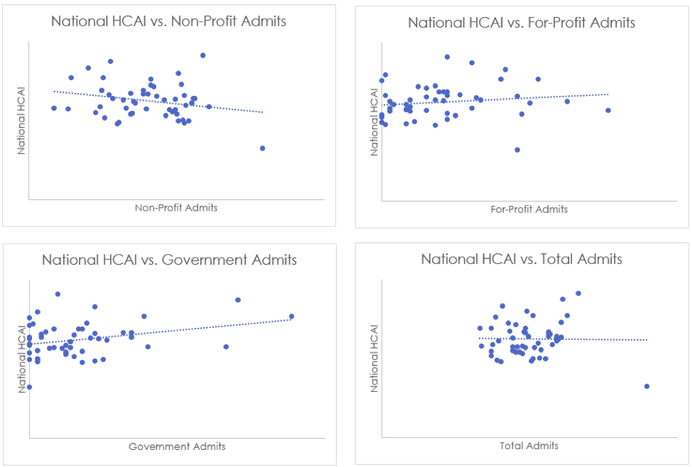
First, we will consider hospital admissions rates[8]. Admissions rates are available by hospital type: non-profit, for-profit, and government-run. We found that for both for-profit and government-run hospitals, there is a positive correlation between the admissions rate and the affordability index. This is interpreted to mean that for government-run and for-profit hospitals, states that have high inpatient utilization also are relatively less affordable (since the higher the HCAI, the less affordable the region). This is an intuitive result: inpatient stays are much more expensive than ambulatory care, and so more inpatient visits should correspond to higher costs. Conversely, we find that non-profit hospitals have a negative correlation between admissions and HCAI. This could be explained by the perverse incentive of for-profit hospitals to encourage admissions in order to increase revenue, whereas non-profit hospitals have more incentive to redirect patients to the most efficient sites of care.
Table 11 below demonstrates the correlation coefficients for the relationships described above. As discussed, we find an inverse relationship between National HCAI and non-profit hospital admissions, but a direct relationship between National HCAI and both for-profit and state/local government admissions.
Table 11: National HCAI as a Function of Hospital Admissions Rates
| Hospital Type | Correlation Coefficient |
| Non-Profit | -0.23 |
| For-Profit | 0.15 |
| State/Local Government | 0.30 |
| Total | -0.02 |
These relationships are further demonstrated in Figure 6 below.
Figure 6: National HCAI as a Function of Hospital Admissions Rates
We note that while hospital admission rates point to the frequency side of inpatient health care utilization, the number of bed days in a hospital can be used to illustrate the severity side. The relationships between AHP HCAI and inpatient bed days[9] is similar to the relationships described above for admissions rates, as shown in Table 12 below.
Table 12: National HCAI as a Function of Hospital Bed Days
| Hospital Type | Correlation Coefficient |
| Non-Profit | -0.21 |
| For-Profit | 0.12 |
| State/Local Government | 0.23 |
| Total | -0.06 |
Table 12 demonstrates that non-profit hospital bed days are inversely related to HCAI, while for-profit and government-run hospitals’ bed days are directly related to HCAI. This may be explained by the same factors driving the relationships between affordability and admissions rates.
Business Climate
Next, we will investigate the relationship between business climate[10] and affordability. We find that for every variation of HCAI, jurisdictions with a more robust business climate have relatively greater affordability. This is demonstrated in Table 13 and Figure 7 below through the moderately strong inverse relationships between HCAI and business climate index.
Table 13: AHP HCAI as a Function of Business Climate
| AHP HCAI | Correlation Coefficient |
| Employee | -0.26 |
| Employer | -0.24 |
| Government | -0.31 |
| National | -0.38 |
Figure 7: AHP HCAI as a Function of Business Climate

We also investigated the relationship between unemployment rate[11] and HCAI. The correlation coefficient between Government HCAI and the unemployment rate is 0.28. This can be explained by considering costs; as the unemployment rate rises, more individuals begin to qualify for public programs such as Medicaid, which raises costs for the government and thus decreases affordability. On the other hand, there is a negative relationship (-0.34) between Employer HCAI and unemployment rate. This implies that in a strong labor market, employers’ income rises such that affordability increases. There appears to be no relationship (-0.08) between Employee HCAI and unemployment, which implies that the income gains accruing to employers in a tight labor market aren’t typically fully passed through to the employees.
Managed Care Penetration
In Table 14 below, please find a demonstration of the relationship between HMO penetration[12] and HCAI.
Table 14: AHP HCAI as a Function of HMO Penetration by Market
| Market | Employee HCAI | Employer HCAI | Government HCAI | National HCAI |
| Commercial | -0.53 | -0.13 | -0.28 | -0.39 |
| MA | -0.10 | 0.27 | -0.21 | -0.12 |
| Medicaid MCO | -0.14 | 0.04 | -0.19 | -0.17 |
| Total | -0.38 | -0.06 | -0.18 | -0.25 |
We see that in the majority of cases, affordability and HMO penetration are negatively correlated, which can be interpreted to mean that a high rate of HMO penetration is associated with increased affordability. This could mean that managed care is “working”; i.e. that an increase in managed care is associated with more efficiencies (or fewer redundancies) and thus reduced costs.
Competition
We have compared HCAI to the degree of competitiveness in the large group[13] and small group[14] markets using the Herfindahl-Hirschman Index (HHI). Low values of HHI indicate more competitive markets while high values of HHI indicate less competitive markets. The correlation coefficient between National HCAI and Large Group HHI is 0.56 while the correlation coefficient between National HCAI and Small Group HHI is 0.44. This indicates that less competitive markets are less affordable. The direct relationships can be observed in Figure 8, below.
Figure 8: National HCAI as a Function of Competitiveness

Market competitiveness has the strongest relationship to HCAI of all the potential drivers that we considered for this analysis. This indicates that stakeholders have cause to be worried about mergers and acquisitions between carriers as they grow ever larger.
Future Outlook
Growth in health expenditures will outpace income growth for all payers for the foreseeable future. For 2018 to 2027, national health expenditures are expected to grow at an average annual rate of 5.5% (with 7.4% for Medicare, 5.5% for Medicaid, and 4.8% for private health insurance)[15]. Meanwhile, per the Congressional Budget Office, real GDP growth is expected to be at most 2.3% over the next ten years[16]. In absence of a major change in the health care landscape, all payers can expect to experience health care becoming less affordable over the next decade.
Conclusion
Though cost is an important factor in health care affordability (and likely an easier lever to pull), we firmly believe that ability to pay should also be considered in any proposed solution to the rising cost of health care. As the economy is expected by some to dip into a recession in the near term, the ability of payers to afford health care will likely dip as well.
The projections are dire, but there still is cause for optimism. Reducing health care costs is a topic at the forefront of the 2020 election conversation. More importantly, we already know a few solutions that can be implemented by innovative providers and payers: increasing care management effectiveness, using the appropriate situs for end-of-life care, and improving population health (just to name a few).
As we continue to propose and debate new health care solutions, we must consider their effect on cost and ability to pay. In doing so, we may be able to stall or reverse some of the worrying trends in unaffordability.
Appendix A: Methodology
The sources used to develop each index are described below.
Employer Index
Employer health care contributions were estimated using the Medical Expenditure Panel Survey (MEPS) Insurance Component. State GDP was calculated using data from the Bureau of Economic Analysis.
Employee Index
Premium costs were estimated using the MEPS Insurance Component, while non-premium out-of-pocket costs were estimated using the MEPS Household Component. Salary was estimated using data from the Bureau of Labor Statistics
Government Index
Medicaid and CHIP expenditures were taken from the Medicaid and CHIP Payment and Access Commission (MACPAC). Medicare expenditures were estimated using historical National Health Expenditure data and the Medicare Enrollment Dashboard File. Medicare enrollee premiums for Part B and Part D were estimated using the Medicare Enrollment Dashboard File along with data accompanying the Medicare Trustees Report. Federal tax income was sourced from the IRS, while state tax income data is from the United States’ Census Bureau.
Endnotes
[1]Andrea M. Sisko, et al. National Health Expenditure Projections, 2018-27: Economic and Demographic Trends Drive Spending and Enrollment Growth. Health Aff. 2019:11.
[2]The most recent year with complete data for each data source
[3]Ashley Semanskee, Cynthia Cox and LL. Data Note: Changes in Enrollment in the Individual Health Insurance Market. Kaiser Family Foundation. https://www.kff.org/health-reform/issue-brief/data-note-changes-in-enrollment-in-the-individual-health-insurance-market. Published July 2018. Accessed May 9, 2019.
[4]Health Insurance Coverage of the Total Population. Kaiser Family Foundation. https://www.kff.org/other/state-indicator/total-population. Accessed May 9, 2019.
[5]The most recent year with complete data for each source
[6]For underlying detailed data for federal and state government expenditures, see tables 05-3 and 05-4 in Centers for Medicare and Medicaid Services: Historical: NHE tables. CMS. https://www.cms.gov/Research-Statistics-Data-and-Systems/Statistics-Trends-and-Reports/NationalHealthExpendData/NationalHealthAccountsHistorical.html. Accessed May 9, 2019.
[7]The most recent year with complete data for each source
[8]Hospital Admissions per 1,000 Population by Ownership Type. Kaiser Family Foundation. https://www.kff.org/other/state-indicator/admissions-by-ownership. Accessed May 21, 2019.
[9]Hospital Inpatient Days per 1,000 Population by Ownership Type. Kaiser Family Foundation. https://www.kff.org/other/state-indicator/inpatient-days-by-ownership. Accessed May 21, 2019.
[10]Data compiled from the Bureau of Economic Analysis. www.bea.gov. Accessed May 20, 2019.
[11]Data compiled from the Bureau of Labor Statistics. www.bls.gov. Accessed May 20, 2019.
[12]State HMO Penetration Rate by Market. Kaiser Family Foundation. https://www.kff.org/other/state-indicator/state-hmo-penetration-rate-by-market. Accessed May 21, 2019.
[13]Large Group Insurance Market Competition. Kaiser Family Foundation. https://www.kff.org/other/state-indicator/large-group-insurance-market-competition. Accessed May 21, 2019.
[14]Small Group Insurance Market Competition. Kaiser Family Foundation. https://www.kff.org/other/state-indicator/small-group-insurance-market-competition. Accessed May 21, 2019.
[15]Andrea M. Sisko, et al. National Health Expenditure Projections, 2018-27: Economic and Demographic Trends Drive Spending and Enrollment Growth. Health Aff. 2019:11.
[16]The Budget and Economic Outlook: 2019 to 2029(January 2019), Congressional Budget Office. www.cbo.gov/publication/54918.
About the Author

Any views or opinions presented in this article are solely those of the author and do not necessarily represent those of the company. AHP accepts no liability for the content of this article, or for the consequences of any actions taken on the basis of the information provided unless that information is subsequently confirmed in writing.