
Last year I developed a ranking system for analyzing consumer value in ACA markets across all 50 states[1]. It was a fun and enlightening exercise. Please see the link below for last year’s rankings which will include the details of my methodology and explanations of the various categories. This year’s ranking uses a similar methodology with slight updates. The purpose of this exercise was to discover meaningful differences between states that would highlight success stories that could be emulated by other states with the ultimate goal of improving value for their ACA consumers.
For 2021, the results are similar with a few notable exceptions. I will walk through some of the biggest improvements and deteriorations in consumer value between 2020 and 2021. Throughout the article, links are provided which will explain important ACA dynamics necessary to understand the following assessments. Please read for further detail. Otherwise, this article assumes the reader knows the non-intuitive nature of how subsidies are calculated in ACA markets.
1. – A new champion is crowned. North Dakota is now ranked #1 in ACA consumer value across the nation with Iowa falling to #4 in the power rankings:
North Dakota had a 97% average Gold to Silver premium ratio in 2020 which improved to 91% in 2021[2]. This is due to the average benchmark premium increasing by 29% while the average lowest-cost Bronze premium remained flat and the average lowest-cost Gold premium increased by just 6%[3]. For a 40-year-old subsidized consumer, this results in a $110 expected reduction in Bronze net premiums and $87 reduction in Gold net premiums[4]. That reduction combined with some of the lowest average gross premiums in the nation leads to the crowning of our 2021 champion.
Iowa on the other hand has trended in the wrong direction due to major shifts in carrier pricing strategies. Medica has historically been a significant metalball player[5] and has leveraged subsidy dynamics to the benefit of the consumer by creating large spreads between the benchmark plan and the lowest Bronze and Gold premiums. In 2021, Wellmark picked off the runner, by choosing to lower costs in response, becoming the benchmark plan in Polk county and dropping their Gold premiums below Silver premiums. Medica had an average Gold to Silver ratio of 83% in 2020 which jumped to 109% in 2021. Wellmark went in the opposite direction from 101% to 91%. The average benchmark dropped by 30%, the average lowest-cost Bronze dropped 22% and the average lowest-cost Gold dropped 16%. For a 40-year-old subsidized consumer, this results in a $132 expected increase in Bronze net premiums and a $134 increase in Gold net premiums.
Iowa still has some of the best gross and net premiums available in the country. However, they had some of the worst swings in net premiums in the country from 2020 to 2021. Large swings in net premiums for low-income consumers is not a positive outcome for a state. This is what could happen when you let carriers self-regulate and completely change metal relationships on a whim. In states like Nebraska, Oklahoma and Iowa, Medica has created really low net premiums through metal level pricing and network offerings but at the same time, large spreads can also introduce the potential for massive instability for yea-over-year net premiums. The ACA works best with tight rate review which leads into the next major takeaway…
2. – Pennsylvania receives the award for most improved, jumping 15 spots to #5 overall.
So what did Pennsylvania do? They made rate review great again[6] by implementing the Joe Pesci option[7] in their market! Pennsylvania introduced strict controls of the induced demand pricing factor and defined a uniform silver loading factor of 20% which resulted in Gold premiums dropping below Silver premiums, parity between carriers and improvements in net premium costs for subsidized consumers that are both substantial and sustainable in years to come. The average Gold to Silver premium ratio improved from 108% in 2020 to 98% in 2021 moving Pennsylvania from the “Keep Diggin” to “Gold Rush” status. The average benchmark premium decreased by 1% while the average lowest-cost Bronze premium decreased by 9% and the average lowest-cost Gold premium decreased by 12%. For a 40-year-old subsidized consumer, this results in a $25 expected reduction in Bronze net premiums and a $55 reduction in Gold net premiums.
The ACA subsidy structure is defined by a simple math problem[8] that doesn’t take an actuary to figure out. However, it does take an actuary to figure out how that math is being distorted, because actuaries know the levers being pulled to create disparities between carriers. Two main levers are typically used to play metal ball which are the induced demand and silver loading factors. Two states, Virginia and Maryland, have made explicit efforts to control these levers. Pennsylvania becomes the third state to regulate these levers and the results are proof of the method. Every state in the nation operates under the same math problem and every state in the nation can implement what Virginia, Maryland and Pennsylvania have done. As Iowa has proven, carriers can self-regulate but even when they do so for the benefit of consumers, it can also lead to wild fluctuations in subsequent years. States like California, New Jersey, Washington, Colorado and other vocal ACA supporting states get the headlines and national press for implementing large scale ACA improvement efforts[9]. But in some cases, those improvements neglect ACA math or have very marginal results for consumers. Pennsylvania should be applauded for taking measures that don’t get headlines but substantially help low-income enrollees in their state without expending state resources.
So let’s be straightforward in showing how simple and easy this is. See this link for what they did.
It’s page 4 number 1 and 3. It’s a few sentences long. Pennsylvania implemented a combination of mandates on carriers that my colleague (Greg Fann) and I have been advocating for since 2018. Pennsylvania forced carriers to tie their induced demand factors to the CMS risk adjustment factors and made silver loading uniform at 20%. Both actions create parity between carriers and reduce net premiums for consumers. Since 2018, a rational consumer assumption would suggest that Silver on-exchange enrollment would trend towards 100% platinum level CSR enrollees resulting in Silver on-exchange premiums reflecting platinum level benefits. We believe under ACA rating rules, it would be justifiable for a state to use 40%-45%[10] as opposed to 20%. There is an opportunity for states to lower consumer costs to an even greater degree. In the end, the Pennsylvania model is a smart step taken by a state to improve consumer value and create parity amongst its carriers.
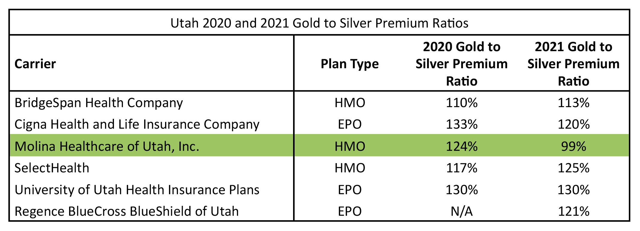
3. – Molina in Utah has created the largest drop in the lowest-cost Gold premium in the nation, dropping 21%. Because of this, Utah climbed 12 spots to #24.
This is an apparent case of a carrier strictly interpreting ACA rating rules and creating great consumer value but doing so by themselves. Utah should pro-actively sustain these actions by establishing parity between carriers for 2022. Pennsylvania has given them a roadmap to do so. If they don’t, we will be watching Utah to see if there are large swings back in the other direction which we have seen in places like California and more recently in Iowa. To get a sense of the lack of parity in Utah that needs to be created by state regulators, see the following table of Gold to Silver premium ratios in the state by carrier between plan years 2020 and 2021. The ACA was designed specifically to avoid these types of disparities in pricing.
4. – South Carolina and Minnesota saw the greatest falling in the power rankings. SC dropped 11 spots to #33 and MN dropped 10 spots to #38.
So what happened to South Carolina? South Carolina did not see any major shift for any one metric but saw a worsening shift in every metric which in combination dropped them 11 spots. Last year, South Carolina had lionfish carriers lurking in their waters but not quite an invasion. In 2021, South Carolina was invaded by lionfish. Consumers overwhelmingly select the Blue Cross and Blue Shield (BCBS) products in the market[11]. In 2020, the BCBS product was the benchmark in 43% of the counties. In 2021, that number was down to 11%. This means that consumers purchasing BCBS products in 2021 will have to pay more to purchase them as they “buy-up” from the benchmark plan. In Greenville county, that was a modest shift of $34 (Change in Benchmark – Change in BCBS lowest Silver from 2020 to 2021) but in places like Greenwood county, that shift was $96. Bottom line, low-income folks will pay more green for Blue in 2021 in South Carolina.
Minnesota in a similar way continues to slide marginally worse in each category with slightly increased Gold to Silver premium ratios and increased lionfish market share. Minnesota also continues to be an unfortunate example of non-intuitive ACA math. In Minnesota, you have some of the lowest gross premiums in the nation but some of the highest net premiums in the nation which negatively impact low-income consumers.
5. – Of the 3 states that have taken direct steps to implement stricter rate review surrounding metalball by regulating induced demand factors, all three of them are in the top 10. Maryland is #2, Pennsylvania is #5 and Virginia is #7.
This is a repeated takeaway because it should be the main takeaway in my opinion. Rate review has often focused on the wrong metric of success in ACA markets by focusing on the overall % change in premiums. Typically, the lower the number the better the job was done. There is no problem with that being a goal but it overlooks the more important metric that actually affects low-income consumers which is the spread of premiums in relation to the benchmark. Making rate review great again through focused rate review[12] relies on changing what we focus on, with the most important element being metal level relationships since half of the subsidized enrollees rely upon the difference between Bronze/Gold to Silver. Virginia, Maryland and Pennsylvania have given us a clear roadmap. Let’s make this nationwide.
The following is a brief review of the metrics used. For greater discussion and detail see the 2020 state rankings article.
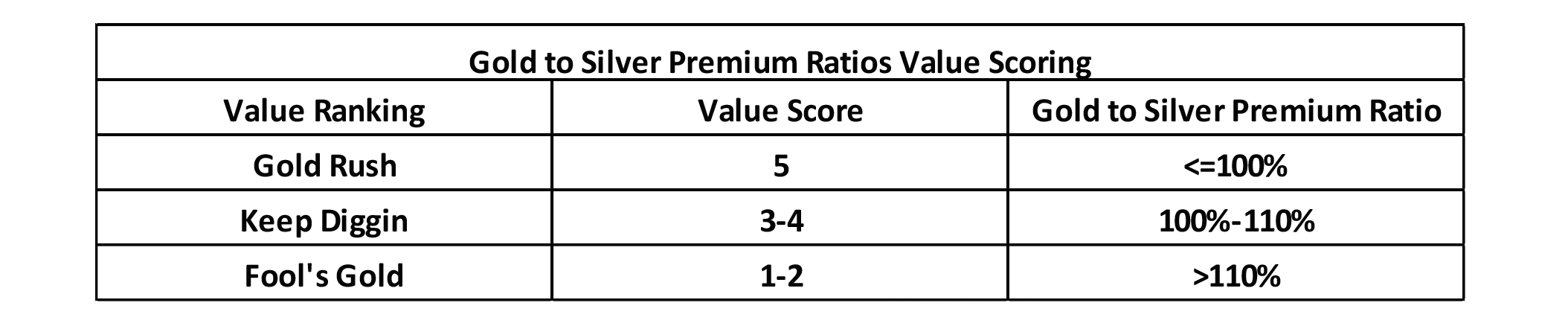
1st Value Category: Gold to Silver Premium Ratios
Metric Used: Average Gold to Silver pricing factors weighted by carrier enrollment for each state. The pricing factors are available on the 2021 URRT public use file[13].
Value Scoring:
2nd Value Category: Lionfish Penetration
Metric Used: For federal exchange states, the % of counties, weighted by county population, that have a Lionfish plan as the benchmark plan. For state-based exchange states, the % total market share of Lionfish plans using 2021 projected member months from the 2021 URRT for plans sold on exchange.
Value Scoring:

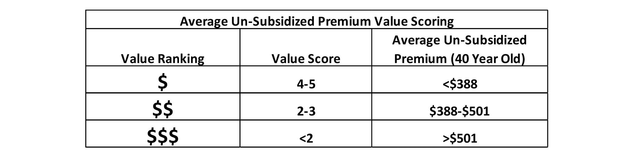
3rd Value Category: Average Subsidized (Net) Premium
Metric Used: Lowest cost Bronze, Silver and Gold net premiums weighted by county population. An average of the three net premiums was used as an overall metric for each state. The rates were for a 40-year-old making 300% of the FPL.[14]
Value Scoring:

4th Value Category: Average Gross Premium
Metric Used: Lowest cost Bronze and Gold gross premiums weighted by county population. An average of the two gross premiums was used as an overall metric for each state. The rates were for a 40-year-old making more than 400% of the FPL.[15]
Value Scoring:
State Ranking
The following table displays the results of my analysis and value scoring. On the far right are two additional columns that did not exist in 2020. One shows the change in total ranking from 2020 (positive is improving rank, negative is worsening rank) and the other shows the 2021 average Gold to Silver premium ratio. The states are also grouped by color code with dark green representing the states with the greatest optimization of value, light green the states with fair optimization, yellow with poor optimization and red being the least optimization. The groupings are based on the total value score and are consistent with the 2020 basis for grouping states. The hope is to get all states in the dark green category (value score greater than 3.75).

Endnotes
[1] https://axenehp.com/gold-rush-lionfish-optimizing-unique-dynamics-aca-markets/
[2] https://axenehp.com/fields-of-gold/
[3] All average premium calculations for the written portion of the article were taken from the following source: https://www.kff.org/health-reform/state-indicator/average-marketplace-premiums-by-metal-tier/?currentTimeframe=0&sortModel=%7B%22colId%22:%22Location%22,%22sort%22:%22asc%22%7D
[4] Reductions in net premiums refer to the change in the spread between the lowest-cost Bronze/Gold premiums and the benchmark. For example, if the benchmark stayed the same and the lowest-cost Bronze premium was reduced by $10, that is referred to as a $10 expected reduction in net premiums. It does not reflect the actual change in net premiums year over year, which is dependent upon other factors like income changes.
[5] https://axenehp.com/metalball/
[6] https://axenehp.com/making-rate-review-great/
[7] https://axenehp.com/joe-pesci-option/
[8] https://axenehp.com/aca-math-and-2020/
[9] https://axenehp.com/hard-pill-to-swallow/
[10] Silver-load would represent Platinum / Silver CMS risk adjustment factors: (.9 x 1.15 / .7 x 1.03)
[11] Statement based on 2021 URRT projected member months in SC.
[12] https://axenehp.com/focused-aca-rate-review/
[13] From Worksheet 2, field name ADJ_FACT_AV_CS. 2021 URRT PUF: https://www.cms.gov/CCIIO/Resources/Data-Resources/marketplace-puf
[14] 2021 California state subsidies were included in the analysis. Federal Exchange states, actual 2021 premiums by county were used and weighted by county. For State based exchange states, the following study was used: https://www.kff.org/health-reform/state-indicator/average-marketplace-premiums-by-metal-tier/?currentTimeframe=0&sortModel=%7B%22colId%22:%22Location%22,%22sort%22:%22asc%22%7D
[15] See note on subsidized methodology.

Any views or opinions presented in this article are solely those of the author and do not necessarily represent those of the company. AHP accepts no liability for the content of this article, or for the consequences of any actions taken on the basis of the information provided unless that information is subsequently confirmed in writing.